Tuesday, 8 August 2017

Tuesday, 11 July 2017
Research: Representation and Online Identity (PointlessBlog)


Logo for PointlessBlog

This is the face of PointlessBlog (Alfie Deyes)
23 year old Alfie Deyes is an English Youtuber and a successful author that runs the Youtube channel PointlessBlog in which he covers a range of different activities. He doesn't only have a Youtube channel, he also branches out through social media and through his successful clothing brand and merchandise lines. As of July 2017 his main Youtube channel has over 5.5million subscribers.

Even though there is no official PointlessBlog website, Alfie's Youtube channel page reflects how he can stay in contact with his fans and to encourage new people to subscribe to his channel. For his main page for aesthetics there is one central image at the top of his page which is his channel's logo and this can help to promote the channel and his successful clothing line and merchandise. The logo can help serve as a synergistic link to especially his channel and clothing brand as his clothing brand has this logo on most of his lines. The logo is simple so people can easily make a synergistic link between the logo and his Youtube channel.

Alfie also quite prevalent on social media as shown on his Youtube channel page with different links to his various social media accounts, for example Twitter, Instagram, Facebook and Google+. This allows him to stay in contact with his fans and helps him to respond to anything his fans might ask him in terms of video ideas or in response to tweets he might send out on Twitter. Here are examples of some of his tweets:

Alfie's target audience based around children and teenagers as his content reflects this as he has other channels such as his vlogging channel and a gaming channel. Where the main and vlogging channels both conform to both gender stereotypes with the content, the gaming channel is conforming more to the male gender stereotype and male target audience (overall). Due to the fact that his content for his videos are family friendly content it appeals to all age groups and doesn't exclude anyone.

Alfie also quite prevalent on social media as shown on his Youtube channel page with different links to his various social media accounts, for example Twitter, Instagram, Facebook and Google+. This allows him to stay in contact with his fans and helps him to respond to anything his fans might ask him in terms of video ideas or in response to tweets he might send out on Twitter. Here are examples of some of his tweets:

An example of a daily vlog on the Youtube channel PointlessBlogVlogs
An example of a gaming video in collaboration with his girlfriend and fellow Youtuber, Zoella, which is found on his PointlessBlogGames channel.
Alfie's convergence to other media platforms
Clothing Brand

The different books that he has written which have become best-sellers
Sunday, 25 June 2017
Thursday, 15 June 2017
Research: Magazine Advert Analysis
Mumford & Sons - Sigh No More (Oct 2009)

The White Stripes - Under Great White Northern Lights (Mar 2010)

Online

Targeting Audiences
Different genres of music target their audience in different ways. I think this is in order to reach as many of their fans as possible and many different genres use different ways to achieve this. Many genres have their own magazines that specialise in their genre of music and appeals to the mass fanbase, for example Kerrang is a Rock/Metal magazine that specialises in focusing on rock orientated music and bands - they include different albums from a range of bands that span the whole genre. Other genres for example Indie music might not have this so they might promote their genre of music through television - for example many indie bands/artists are found to promote their music through a television programme called 'Sunday Brunch', where they have specific sections throughout the show where they have different bands/artists perform their music and it is mostly smaller/less well-known Indie bands/artists - this can help to create a target audience or help the band/artist expand their target audience as this is one of the largest shows on the tv during the morning on a Sunday.
Saturday, 10 June 2017
Research: Digipaks
What is a Digipak?

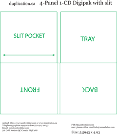
A type of packaging for CDs or DVDs, typically made from cardboard with an internal plastic holder for one or more discs. It is a marketing tool intended to offer the buyer an incentive for purchasing the hard copy from a high street or online retailer than downloading/streaming the music. The incentive is basically extras added to the CD in addition to the actual disk and its case with front and back covers.
What is the layout of a Digipak?
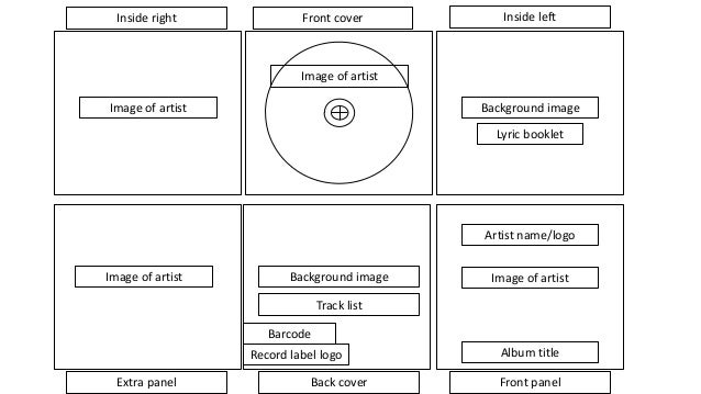
6 Panel Digipak
Advantages
- The fact that there is multiple panels means that the digipak can be 'filled' with more extra content that can encourage more fans to buy the product, maybe also people that has just started to listen to the band.
- There can be more exclusive artwork within the digipak which helps to enhance the experience for the fans that buy the product.
Disadvantages
- The 'extra' panels can make this digipak quite thick, in a sense that if fans wanted to place these on a shelf with other digipaks/CD's these types of digipaks would take up quite a lot of shelf space.
4 Panel Digipak
Advantages
- The fact that it is 4 panels shows that it can be compact - which appeals to fans that are avid collectors of CD's as they can help to fit on people's shelves or in a place where they keep their CD collection.
Disadvantages
- Due to the fact that this is only four panels this limits the amount of content that can be placed within the digipak is limited - which doesn't really encourage fans to buy this as they aren't really getting their value for money - there wouldn't be any point so they instead buy either the digital download copy or stream it.
Digipaks include:
- A Front Cover
- A Back Cover
- A Spine
- At least four other panels within the Digipak itself
The Additional will comprise of some or all of these things:
- Membership Postcard/Flier
- Lyric Section
- Disk Impression
- Band Info Section/Booklet
- Free Image/Poster/Set of Postcards
Retailers
HMV (Online/High-Street Retailer)
 Amazon (Online Retailer)

Examples of Digipaks


Digipak Analysis: Wu Tang Clan - Enter the Wu Tang - 36 Chambers (1993)


- A Front Cover
- A Back Cover
- A Spine
- At least four other panels within the Digipak itself
The Additional will comprise of some or all of these things:
- Membership Postcard/Flier
- Lyric Section
- Disk Impression
- Band Info Section/Booklet
- Free Image/Poster/Set of Postcards
Retailers
HMV (Online/High-Street Retailer)


Examples of Digipaks
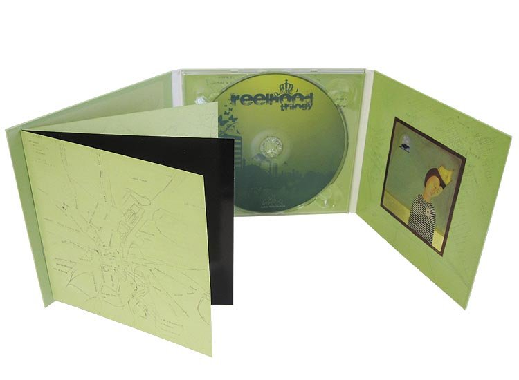

Digipak Analysis: Wu Tang Clan - Enter the Wu Tang - 36 Chambers (1993)


Tuesday, 17 January 2017
Preliminary Task - Continuity Editing
Original Video
Brief
We were tasked to produce a short film that showed specific skills and actions. We were informed that the film would need to show continuity editing, match on action, 180 degree rule and shot reverse shot. These were included in our short film.
Match on action
This is where one shot seemlessly cuts to another. Here we can see the character walk through the door and then the camera cuts to the inside where we see the character walk through the door on the other side.
180 degree rule
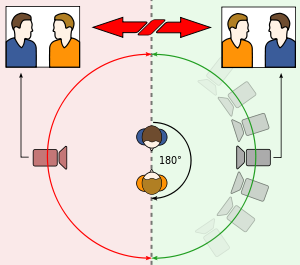
The 180 degree rule is where the camera stays on one side of a conversation so it wouldn't interupt the flow of the conversation and also wouldn't confuse the audience as the characters don't change sides. We used the 180 degree rule with shot reverse shot. Shot reverse shot is when the camera switches between two characters while they are in conversation with each other.
180 degree rule

Pre-Production
Due to the fact that we had such a small amount of time for this task we had very limited planning and the Pre-Production was very quick and rushed.
Storyboard
Due to the short time frame we were unable to create a storyboard for our preliminary task so we decided on an idea and put it together before we started shooting the task for real.
An example would be like this:

Story
Initially we decided to do a horror, psychological narrative but during the filming stage we found that a more romantic comedy style would work better with the footage that we had shot already. On the way back from filming we decided with the footage we had how we would edit it together to look more like a romantic comedy.
Location
Due to the fact we were limited to our school grounds, we suggested using locations which were familiar to us so we could get the scenes shot quickly and that we prioritised finding a few locations which would be noticeably quieter. This led us to use the main strip in the car parking area and the toilets within one of our school blocks. This enabled us to adapt our script and story to the surroundings so we could get the perfect shots for shooting the footage.
Original Video
Brief
We were tasked to produce a short film that showed specific skills and actions. We were informed that the film would need to show continuity editing, match on action, 180 degree rule and shot reverse shot. These were included in our short film.
Match on action
This is where one shot seemlessly cuts to another. Here we can see the character walk through the door and then the camera cuts to the inside where we see the character walk through the door on the other side.
180 degree rule
The 180 degree rule is where the camera stays on one side of a conversation so it wouldn't interupt the flow of the conversation and also wouldn't confuse the audience as the characters don't change sides. We used the 180 degree rule with shot reverse shot. Shot reverse shot is when the camera switches between two characters while they are in conversation with each other.
180 degree rule
Shot Reverse Shot

Due to the fact that we had such a small amount of time for this task we had very limited planning and the Pre-Production was very quick and rushed.
Storyboard
Due to the short time frame we were unable to create a storyboard for our preliminary task so we decided on an idea and put it together before we started shooting the task for real.
An example would be like this:
Story
Initially we decided to do a horror, psychological narrative but during the filming stage we found that a more romantic comedy style would work better with the footage that we had shot already. On the way back from filming we decided with the footage we had how we would edit it together to look more like a romantic comedy.
Location
Due to the fact we were limited to our school grounds, we suggested using locations which were familiar to us so we could get the scenes shot quickly and that we prioritised finding a few locations which would be noticeably quieter. This led us to use the main strip in the car parking area and the toilets within one of our school blocks. This enabled us to adapt our script and story to the surroundings so we could get the perfect shots for shooting the footage.
Sunday, 4 December 2016
Research: Film Openings- Institutional
Film 1: 'Batman' (1989, Burton)

 -The use of having the distribution company at the start of the opening it encourages people to see the film because if the audience notices a well-known distributor then they are more likely to see the film. -The text for the institutional titles and the main title are in a normal font, but in the yellow colour, this hints the batman logo and colours, the yellow text also juxtaposes with the dark background, emphasising the title of the film and the people who have been involved in the production process of making this film.
-The Batman theme is heard playing throughout of the opening, suggesting it's debut and orchestration specifically for this film.
-Throughout the opening the soundtrack has periods of builds and fades/slows, coupled with the different transitions within the images (so with fast paced build of the soundtrack the images transition speeds up and this is the opposite for the slow paced sections of the soundtrack).
-For the visuals, there really isn't much to show as it is just a dark transition of the logo, close up, until the very end when it shows the full Batman logo.
-The build ups create a sort of action, intense atmosphere which gets people to start to look forward to the film.
-The main title of the film and other titles are centred in the frame, it tries to emphasise the main title and the people involved in making this film happen.
-In this opening there is 27 institutional titles which suggests to us as the audience that this is a big budget film which has had a lot of effort put into the making of this film due to the large number of institutional titles.
-For this opening it only has one camera transition, which is like a panning shot of a close-up of the Batman logo, this gets the audience to wonder what the film is about, thus getting people wanting to know what more of the narrative is, therefore they sit and watch the rest of the film to know what the narrative is.
- Orchestral sound is used heavily through the opening for this film, especially when the batman theme was specifically composed for the film, makes the film more memorable for the audience.
Film 2: 'Blade 2' (2002. Del Toro)

 - For Blade 2 the institutional line is quite sparse, with only 4 institutional titles throughout the opening, this could be because the film makers want people to focus more on the voice over and the visuals more than the text, to get people to be excited for the rest of the film, plus it fills in the narrative for people who cannot remember the events of the first film or to fill in the narrative for people who may not have seen the first film.
- Throughout the opening the main theme for blade plays while also having Blade's voice over for the majority of the opening, which fills in the narrative for the audience.
- Other pieces of audio are really just sound effects which enhance the experience to make it sound more realistic for the audience.
- The Visuals as mainly made up of scenes from the pervious film, thus allowing the audience to familiarise themselves with the narrative of the film.
- Other visuals include the use of different weapons (props) which suggests that he is getting ready for a battle, resulting in the audience deducing that this is a action film, coupled with a pinch of horror, due to the bloody clips and the voice over.
-The main title for this film is in the centre of the frame this shows the title of the film clearly, a grabs the audience's attention onto the man title.
-This uses a mixture of moving and still images which help to show the narrative and characterisation.
- The use of gram negative filters on some scenes within the opening create a sense of horror for the audience.
- The use of many props within the opening helps to set the genre for the rest of the film resulting in the audience thinking that this is an action film.
Group film opening analysis
'The Conjuring' (2013, Wan)


- In this opening throughout the soundtrack is quite eerie, thus creating an uncomfortable feel for the audience, therefore adding to the sense of horror.
- Also for the audio in the opening, in certain places a sound is added for roughly a second suddenly (For example a crow or a door bell or a door opening), resulting in a scary atmosphere.
- For the visuals it shows old newspaper articles, which adds to the sense of realism to which the audience can relate to and gets the audience to believe that this actually happened.
- For institutional titles, there are 17 in all in which show mostly the actors names and the director's name which is shown twice, both at the beginning of the opening and the end, to show who the director is.
- In some sections the music builds which creates a more intense atmosphere, which makes the viewing experience more uncomfortable for the audience, thus enhancing the horror feeling, which the film and the director is hoping to achieve, for the film to be successful.
- This opening uses mostly still images, but for the turning of news article pages they use a moving images to give it a sense of realism of actually turning the pages of the article.
- Throughout the opening the producers are given a mention especially the executive producers.
- The visuals throughout (the newspaper articles) create the narrative of the film by showing he audience past events before the film's proper beginning, this is also hinted towards the end with the still image of the tree and the large farm house in the background, with a noose tied to one of the branches of the tree, resulting in the audience suspecting the most recent past narrative or this could hint events that are to come later in the film, it gets the audience to start to guess whether this is a past or future reference.
- Different props are used to convey a horror tone for example a Ouija board is used in one of the clips, this is usually associated with horror scenes, this gets the audience to experience the horror aspect of this opening.
General sense from film openings- what the audience experiences in general, what ideas they are given.
From film openings the audience can get a sense of the idea of what the film would be about without having to see the whole film to the end to get the sense of narrative. Also the audience can check to see which production companies are involved to see whether any well-known companies have been used to make this film happen. Moreover the audience can see who actually is directing it, because a well-known director can get people to watch the rest of the film, plus not question what is happening (in this section of the film), as people would be sort of familiar with their work. Finally the audience can see who is actually starring in this film, this can form opinions for many viewers, as different actors/actresses are right for specific roles. Film openings establish quite a few things for the audience. It can establish:
- Location of film
- Characters
- Narrative of the film
- Title, Credits
- Genre
- Tone/Atmosphere
Film 1: 'Batman' (1989, Burton)


-The Batman theme is heard playing throughout of the opening, suggesting it's debut and orchestration specifically for this film.
-Throughout the opening the soundtrack has periods of builds and fades/slows, coupled with the different transitions within the images (so with fast paced build of the soundtrack the images transition speeds up and this is the opposite for the slow paced sections of the soundtrack).
-For the visuals, there really isn't much to show as it is just a dark transition of the logo, close up, until the very end when it shows the full Batman logo.
-The build ups create a sort of action, intense atmosphere which gets people to start to look forward to the film.
-The main title of the film and other titles are centred in the frame, it tries to emphasise the main title and the people involved in making this film happen.
-In this opening there is 27 institutional titles which suggests to us as the audience that this is a big budget film which has had a lot of effort put into the making of this film due to the large number of institutional titles.
-For this opening it only has one camera transition, which is like a panning shot of a close-up of the Batman logo, this gets the audience to wonder what the film is about, thus getting people wanting to know what more of the narrative is, therefore they sit and watch the rest of the film to know what the narrative is.
- Orchestral sound is used heavily through the opening for this film, especially when the batman theme was specifically composed for the film, makes the film more memorable for the audience.
Film 2: 'Blade 2' (2002. Del Toro)


- Throughout the opening the main theme for blade plays while also having Blade's voice over for the majority of the opening, which fills in the narrative for the audience.
- Other pieces of audio are really just sound effects which enhance the experience to make it sound more realistic for the audience.
- The Visuals as mainly made up of scenes from the pervious film, thus allowing the audience to familiarise themselves with the narrative of the film.
- Other visuals include the use of different weapons (props) which suggests that he is getting ready for a battle, resulting in the audience deducing that this is a action film, coupled with a pinch of horror, due to the bloody clips and the voice over.
-The main title for this film is in the centre of the frame this shows the title of the film clearly, a grabs the audience's attention onto the man title.
-This uses a mixture of moving and still images which help to show the narrative and characterisation.
- The use of gram negative filters on some scenes within the opening create a sense of horror for the audience.
- The use of many props within the opening helps to set the genre for the rest of the film resulting in the audience thinking that this is an action film.
Group film opening analysis
'The Conjuring' (2013, Wan)
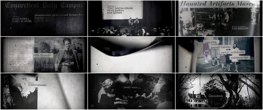


- In this opening throughout the soundtrack is quite eerie, thus creating an uncomfortable feel for the audience, therefore adding to the sense of horror.
- Also for the audio in the opening, in certain places a sound is added for roughly a second suddenly (For example a crow or a door bell or a door opening), resulting in a scary atmosphere.
- For the visuals it shows old newspaper articles, which adds to the sense of realism to which the audience can relate to and gets the audience to believe that this actually happened.
- For institutional titles, there are 17 in all in which show mostly the actors names and the director's name which is shown twice, both at the beginning of the opening and the end, to show who the director is.
- In some sections the music builds which creates a more intense atmosphere, which makes the viewing experience more uncomfortable for the audience, thus enhancing the horror feeling, which the film and the director is hoping to achieve, for the film to be successful.
- This opening uses mostly still images, but for the turning of news article pages they use a moving images to give it a sense of realism of actually turning the pages of the article.
- Throughout the opening the producers are given a mention especially the executive producers.
- The visuals throughout (the newspaper articles) create the narrative of the film by showing he audience past events before the film's proper beginning, this is also hinted towards the end with the still image of the tree and the large farm house in the background, with a noose tied to one of the branches of the tree, resulting in the audience suspecting the most recent past narrative or this could hint events that are to come later in the film, it gets the audience to start to guess whether this is a past or future reference.
- Different props are used to convey a horror tone for example a Ouija board is used in one of the clips, this is usually associated with horror scenes, this gets the audience to experience the horror aspect of this opening.
General sense from film openings- what the audience experiences in general, what ideas they are given.
From film openings the audience can get a sense of the idea of what the film would be about without having to see the whole film to the end to get the sense of narrative. Also the audience can check to see which production companies are involved to see whether any well-known companies have been used to make this film happen. Moreover the audience can see who actually is directing it, because a well-known director can get people to watch the rest of the film, plus not question what is happening (in this section of the film), as people would be sort of familiar with their work. Finally the audience can see who is actually starring in this film, this can form opinions for many viewers, as different actors/actresses are right for specific roles. Film openings establish quite a few things for the audience. It can establish:
- Location of film
- Characters
- Narrative of the film
- Title, Credits
- Genre
- Tone/Atmosphere
Subscribe to:
Posts (Atom)